Yafira Martinez
print + code | fall 2025

print.code( );

A documentation hub for my Print & Code work—an exploration of computational craft, where ink, paper, and algorithms are integrated into a single workflow. This space documents projects, process traces, scans, datasets, and source code, tracing how images are generated, materialized, and iterated across digital and physical contexts.

print + plot code as system computational craft

riso animation

print as time-based system · animation translated into physical frames

sailor moon inspired riso animation

[riso] frame sequence · scan → loop · printer: frida

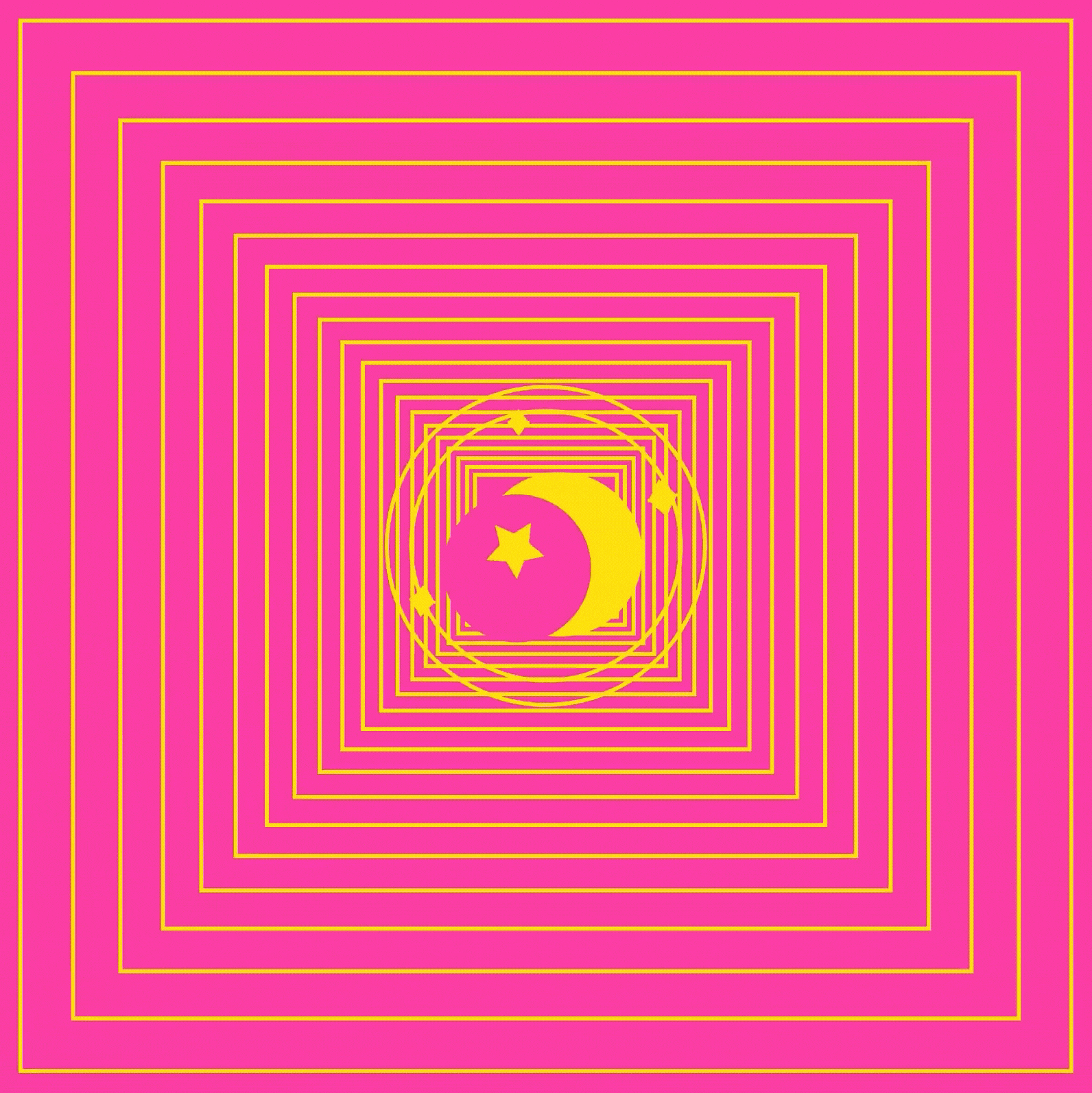
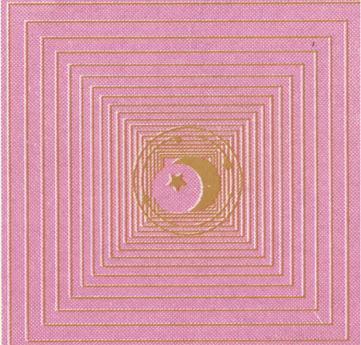
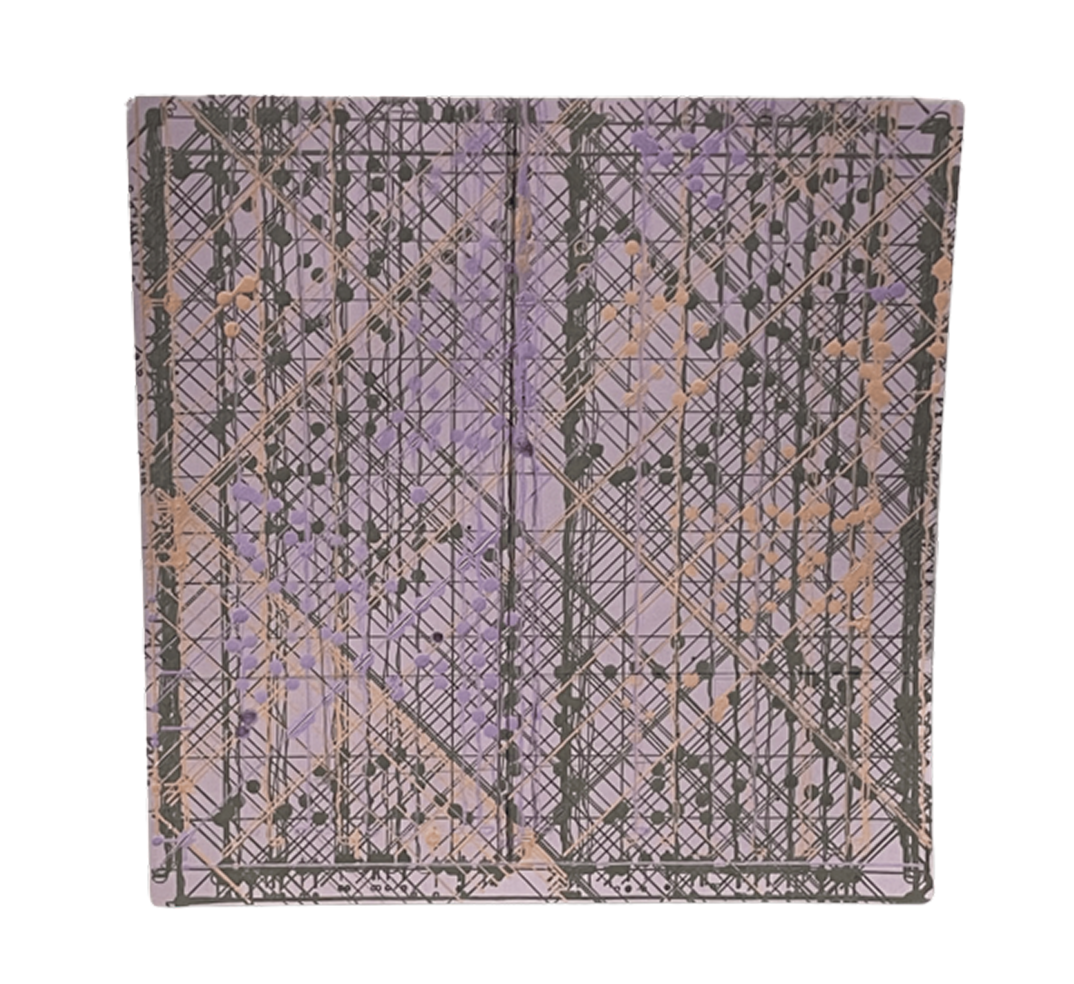
For this project I created a Sailor Moon inspired risograph animation. Sailor Moon was my favorite anime growing up, so it felt natural to return to it as a source of visual language and nostalgia. The main element I animated was the star symbol, which rotates as the central motion. At first I experimented with bold, bright colors, but once I printed it I realized they came out much harsher than expected. That was a surprise, something that looked more soft and luminous on screen appeared almost overwhelming in print. This led me to make a second version with pastel tones.

I like that the adjusted yellow and gold almost resemble a stamped texture, which gives the piece a tactile quality. Another detail I especially enjoy is the dithering effect produced by the risograph process. The halftone dots and gradients create a textured look that makes the animation feel layered and physical, giving it a softness that could not be fully replicated digitally. It also connects back to the retro anime and manga aesthetic of Sailor Moon itself, which often used screen tones and grainy textures to create atmosphere.

Digital vs Analogue Workflows

The production process highlighted the difference between digital and analogue workflows. In my p5.js sketch, the animation feels smoother and more dynamic because the code generates movement continuously. Translating that into a frame-based risograph sequence required me to limit the motion to discrete stills. I ended up producing many frames, but paradoxically the effect was less animated than my original sketch. It made me think more carefully about how few frames are needed to suggest motion effectively, and where excess becomes static.

Glitch and Noise

The process also connected to our readings on glitch and noise. In the translation from screen to print and back to screen (digital → analog → digital), unexpected forms of noise appeared. Color shifts, uneven textures, dithering, and slight misalignments worked as glitches that added character. Instead of being errors, these became aesthetic features, reminding me of how compression artifacts or VHS static, once considered flaws, now read as nostalgic or stylistic choices. I was surprised by how much I welcomed these "imperfections." They gave the animation a tactile richness that my p5 version lacked.

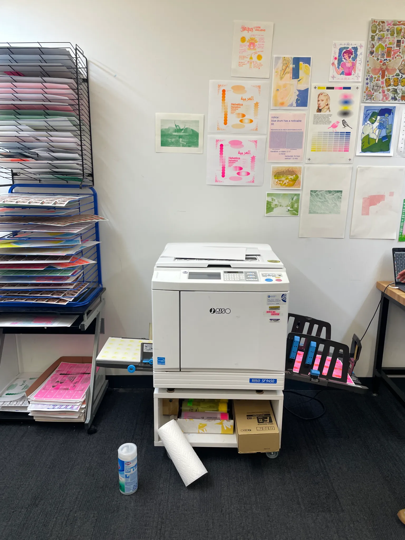
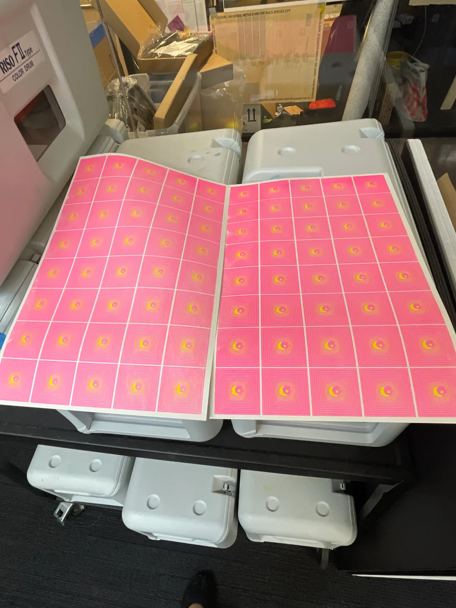
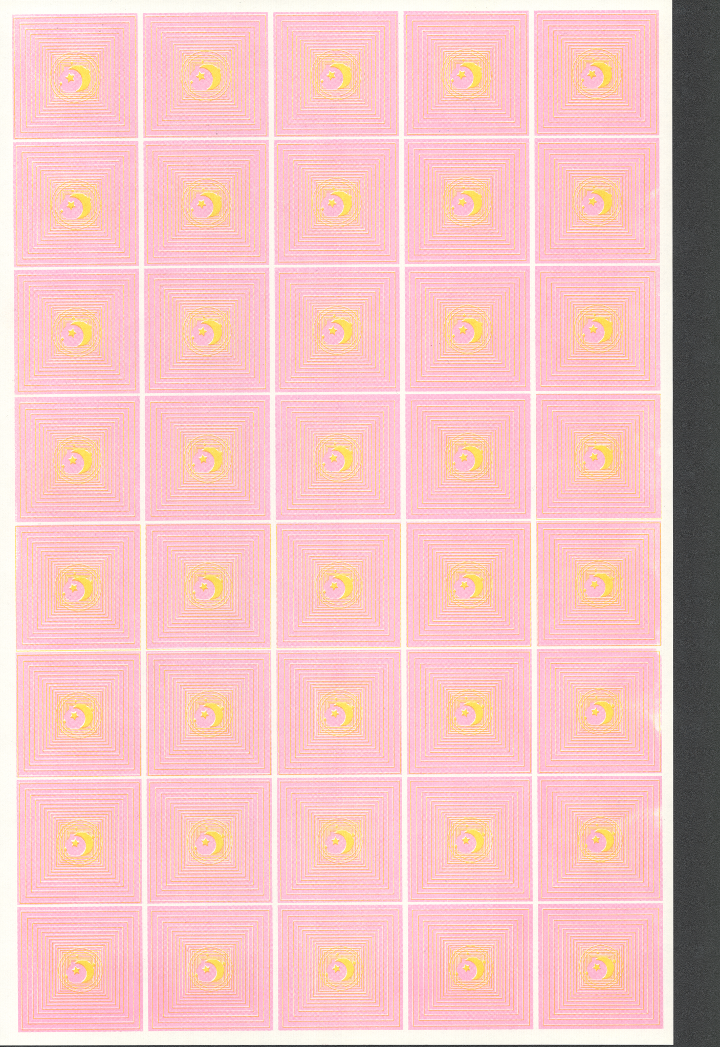
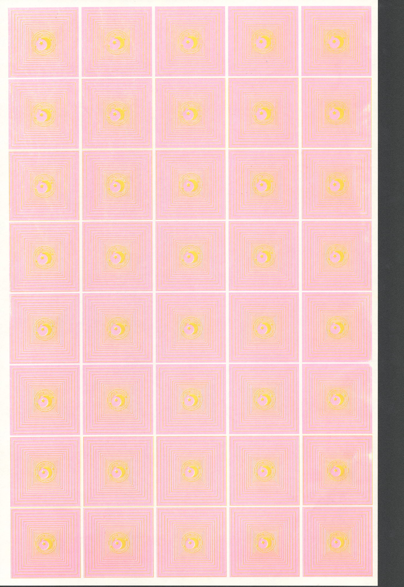
The Actual Process: The process moved through several stages across both digital and analog tools. I first developed the sketch in p5.js, testing out colors, movement, and frame counts in code. Once I had the star animation working digitally, I separated the frames and prepared them for print at the riso lab. Printing was its own experiment—colors shifted, layering created unexpected textures, and the dithering patterns emerged through the risograph's limitations.

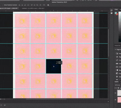
After printing, I scanned the individual frames back into the computer and compiled them in Adobe Photoshop, where I built contact sheets to organize the sequence. From there, I assembled the frames into an animation, layering them back together into a moving loop. Each step introduced its own character: coding produced smooth continuous motion, printing introduced tactile noise and color shifts, scanning translated those textures into pixels, and finally Photoshop restructured the sequence into a cohesive animation.

Reflection

I would probably recreate this animation again and try my best to cut the frames so it won't have such a wobbly effect. Nonetheless I am content with the riso texture it brings to life.

Reflecting on this project, I see glitch and noise not as disruptions but as collaborators in the process. They make the work feel less polished and more human, carrying traces of the materials and machines involved. That tension between my controlled digital sketch and the noisy analogue print revealed how animation can live across mediums, each step introducing its own unexpected variations. Ultimately, this project reminded me that part of animating is allowing the process to transform the image, even when it veers away from what I initially imagined.

design system

code as layout logic · strict hierarchy · data-driven composition

the department of lost circuits

[p5] generative postage series · riso-ready halftone plates

single stamp detail
single stamp detail

Over the past few weeks, I've been developing The Department of Lost Circuits, a generative postage series that reimagines obsolete electronics as collectible design artifacts. Each stamp in the series represents a different historical device, from Braun radios and Sharp pocket computers to the Nintendo Game Boy Sewing Machine. The stamps are not only visual tributes but also data-driven compositions that weave together information about the object's design, production era, and technological lineage.

Why Stamps?

inspiration references
inspiration + references

Postage stamps are tiny monuments. They preserve histories that nations decide are worth circulating: people, landmarks, inventions. I chose stamps because they feel both antique and ceremonial, a perfect match for technology that has slipped from the present. They are archival but personal, handled by many, collected by few. Turning obsolete devices into stamps restores a sense of dignity to objects often discarded without a second thought.

Data as Design Material

Each stamp is generated in code using p5.js, combining algorithmic layouts with historical metadata. The layout system establishes a strict visual hierarchy: product image at center, year and manufacturer below, rarity stars in the upper corner, and price or value markers framed in minimalist black circles. These visual anchors create a rhythm across the sheet, referencing both typographic order and the archival precision of catalog systems.

dataset mapping image
dataset structure + mapping

The dataset now includes 40 discontinued devices spanning 1961–2016. A new field, material_components, documents each device's "material afterlife"—what these devices become when discarded: cathode ray tubes and leaded glass, lithium polymer batteries and magnetic tape oxide, polycarbonate shells and copper circuit traces.

Creating the Border System

A key recent addition has been the border system. Previously, every stamp shared a simple perforated outline. Now, each stamp randomly generates one of several unique border styles, including perforated, dotted, zigzag, and scalloped frames. The scalloped style, inspired by traditional postage silhouettes, adds a tactile sense of authenticity and rhythm to the grid. The generative variation keeps the sheet visually dynamic, like a philatelic field of tiny architectures.

I also integrated material metadata into the composition. Each object's CSV entry now includes its material_components. These materials are represented as small geometric glyphs positioned beneath the image. The system parses the text automatically, identifying material keywords and rendering a set of icons that mirror industrial design language.

Milestone: Preparing for riso printing. I added a toggle to convert RGB previews into two-color halftone layers (black + teal, later changed to baby blue + fluorescent pink), optimized for risograph output. Where they overlap, a surprising purple emerges—a happy accident that reinforces the theme.

riso ink tests
riso ink tests
riso ink tests alternate
riso ink tests (alt)
Bayer Halftone System

As part of preparing The Department of Lost Circuits for Risograph printing, I've been working with halftone dithering to convert digital images into printable ink patterns. The method I'm using is based on a Bayer matrix, a small repeating grid that decides how dots of ink are distributed to represent different shades of gray.

What a Bayer Matrix Does

When a photograph is printed in a single color of ink, it can't rely on RGB values. Instead, it creates the illusion of tone by varying dot density. The Bayer matrix helps organize this process by assigning a threshold to each pixel.

Smaller matrices (like 4×4) produce chunkier, high-contrast textures, while larger ones (like 8×8) result in smoother gradients. The choice affects the print's personality: 4×4 is bold and graphic, great for low-detail images or strong contrast; 8×8 gives smoother tones, ideal for photographs and subtle shading.

Why It Works Well for RISO

The Risograph is a mechanical stencil printer, so it loves predictable dot patterns. Ordered dithering produces clean, geometric textures that don't blur or misalign easily. Because this project combines industrial imagery and archival layouts, the Bayer matrix fits conceptually too—it bridges digital precision with the analog imperfections of RISO printing, where each dot is both mechanical and expressive.

// TEAL PLATE (RISO): auto-levels → Bayer dither → place on layer
function drawImageHalftone_toLayer(layer, d, x, y, w, h) {
  const margin = 45;
  const imgX = x + STAMP_INSET + margin;
  const imgY = y + STAMP_INSET + margin;
  const imgW = w - (STAMP_INSET + margin) * 2;
  const imgH = h - (STAMP_INSET + margin) * 2 - 150;

  const img = d.image_path ? images[d.image_path] : null;
  if (!img || img.width === 0) return;

  // fit image proportionally
  const imgRatio = img.width / img.height;
  const boxRatio = imgW / imgH;
  let drawW, drawH;

  if (imgRatio > boxRatio) {
    drawW = imgW;
    drawH = imgW / imgRatio;
  } else {
    drawH = imgH;
    drawW = imgH * imgRatio;
  }

  const cx = imgX + (imgW - drawW) / 2;
  const cy = imgY + (imgH - drawH) / 2;

  // normalize contrast (auto-levels)
  const leveled = autoLevelsGray(src, LEVELS_CLIP_LOW, LEVELS_CLIP_HIGH, LEVELS_GAMMA);

  // convert to halftone using Bayer dithering
  const dithered = (DITHER_MATRIX === '8x8')
    ? bayerDither8x8(leveled, DITHER_GAIN, DITHER_BIAS)
    : bayerDither4x4(leveled, DITHER_GAIN, DITHER_BIAS);

  layer.image(dithered.get(), cx, cy);
}

System Implementation with EasyGrid

The system uses EasyGrid for layout management, making positioning and spacing systematic. The pseudocode establishes: 3 columns × 5 rows (adjustable), RISO layers (coral for circuits, teal for text), and visual rules using the map() function—circuit density maps to release year, category determines shape (audio = circle, storage = square, display = triangle, computing = hexagon, gaming = pentagon), and discontinued year affects opacity.

alternate stamp sheet

Where Are These Devices Today?

Many of these objects still exist, just not where we expect. Some are lost inside closets and junk drawers, too important to throw away but too outdated to use. Others are museum artifacts with plaques explaining their once-revolutionary features. A few are collector trophies auctioned online for high prices. Meanwhile, mountains of similar devices are buried in e-waste streams around the world. This spread—from trash to treasure—shows how unevenly we value the past.

Reflection

Department of Lost Circuits is becoming both a historical archive and a meditation on obsolescence. By transforming discarded technologies into carefully printed artifacts, the series asks what it means to preserve digital culture in material form and whether code can act as a new kind of conservation tool. Working on this project shifted my attention from objects to their afterlives. Consumer technology does not disappear. It simply becomes invisible.

machine drawing

plotter as collaborator · slow computation · parametric editions

magnetic core memory

[plotter] p5 + svg · generative homage to woven circuits

This was genuinely my first time using a pen plotter. There was a phase a while ago when I became obsessed with watching plotter drawings online—videos of machines slowly tracing ink, artists plotting geometric patterns with multiple pens, and long, meditative drawing processes. I was tempted to get one for home use, but that phase eventually faded.

Now it's come back in a much more meaningful way. Seeing what's possible with plotting beyond pure machine drawing has shifted my perspective. Plotters aren't just mechanical tools; they're being used for textile patterning, experimental circuitry, and even edible ink drawings on cookies (which I very much want to try). That realization made me want to explore the plotter as a bridge between design, code, and fabrication.

A Brief History of Core Memory

historical examples of magnetic core memory
historical examples of magnetic core memory planes and woven circuits

I created a generative pattern inspired by magnetic core memory, one of the earliest forms of computer memory used from the 1950s through the early 1970s. Core memory consisted of tiny ferrite rings ("cores") woven into a grid of wires, each magnetized in one of two directions to represent a binary 1 or 0. It was both an engineering marvel and a hand-crafted object—the physical fabric of computation before silicon chips.

Invented in the late 1940s by Jay Forrester at MIT's Whirlwind project, core memory became the standard for computers throughout the 1950s and 60s. It powered machines like the IBM 1401 and the Apollo Guidance Computer. The first computers to fly to the Moon were literally woven by hand.

What fascinates me most is that these memory planes were often assembled bywomen with incredible dexterity, threading wires through microscopic rings using fine needles. Each bit of memory was physical, tangible, and placed with care. Core memory was textile computation: computing as weaving, logic as fabric, data as something soft and structured.

Pattern & Code

I've always been drawn to circuit art in all its forms—freeform soldering, wire sculptures, experimental PCBs, breadboard chaos. Circuits feel like drawings to me: technical, but deeply poetic. The grid-like weave of core memory sits perfectly at the intersection of textile and technology, structure and softness.

Using p5.js with the p5.svg renderer, I built a system that generates a stylized "core memory panel," complete with vertical and horizontal bus lines, crisscross stitches, and subtle imperfections. The pattern went through several iterations, adjusting density, spacing, stroke weight, wire behavior, and randomness until it felt digitally hand-woven rather than mechanically perfect.

Machine Drawing Note: This drawing is not animated. It is computed once, like a print pulled from a press. The code behaves less like a sketch and more like a small drawing machine with adjustable "knobs."

Parametric System & Code Structure

The Drawing is Parametric

A handful of global variables define the entire system:

let seed = 42;                 // reproducible variations
let coreSpacing = 35;          // grid density
let coreSize = 18;             // motif scale
let coreThickness = 6;         // ring thickness
let seamless = true;           // infinite tiling
let plotMode = true;           // stroke-only plotting

Single-Frame, Print-First Logic

randomSeed(seed);
noLoop();

Drawing Pipeline (Layers)

const { cols, rows, startX, startY } = computeGridParams();
drawVerticalWires(cols, rows, startX, startY);
drawHorizontalWires(cols, rows, startX, startY);
drawDiagonalWires(cols, rows, startX, startY);
drawAllCores(cols, rows, startX, startY);

Controlled Imperfection

const jitterX = random(-0.5, 0.5);
const jitterY = random(-0.5, 0.5);

if (random() > 0.02) {
  drawCorePlot(x + jitterX, y + jitterY);
}

This introduces softness without breaking the underlying structure—the machine hesitates, but never collapses.

Iterations

I plotted three different physical iterations from the final code:

  • Industrial version — plotted on brown craft board, evoking mid-century lab hardware
  • Minimal version — black on white, emphasizing geometry and structure
  • Textured multi-ink version — layered lines and overlapping color, messy and dense, closer to how real core memory looks under magnification

The final plot took nearly two hours to complete and even ran one of my pens dry halfway through, causing a subtle color shift. I changed pens to mask it, but that accident gave the piece a layered quality I ended up liking. Even after producing three versions, I'm still undecided on which one I like most. Each represents a different side of my ongoing fascination with magnetic core memory as both an aesthetic system and emotional artifact.

Process Notes

  • Plotter: AxiDraw pen plotter
  • Pens: Sakura Gelly Roll, Micron 005
  • Paper: cardstock
  • Plot time: ~25–30 min (first two), ~2 hours (final)

Watching the plotter slowly trace each ring and wire felt meditative—a form of slow computation that echoes the original labor of weaving memory by hand. It sits somewhere between digital precision and human care.

experimental publications

tutorial as art · dataset publication · touch, parody, archives

how to touch electricity

[part a] soft circuits for soft beings · zine + basic kit

There's a moment in many electronics tutorials where everything becomes rigid. The language hardens. The diagrams flatten. Touch disappears. Electricity becomes something you control, not something you feel. This small zine began as a refusal of that moment—and also as my first actual zine.

How to Touch Electricity (Soft Circuits for Soft Beings) was created for Experimental Publishing: Tutorial as Art, an assignment that asks us to treat tutorials not just as instructional tools, but as cultural and artistic objects. Rather than focusing on efficiency or mastery, the project explores what happens when a tutorial becomes poetic, tactile, and emotionally aware.

The zine is a simple, hands-on guide to soft circuits that teaches basic electronic ideas—connection, resistance, flow—through gentle, embodied interaction. It is paired with a small physical kit, allowing the reader to build and activate each circuit directly (coin battery, copper tape, spare LED sticker).

Rather than asking "How does this work?" the zine asks: What does electricity feel like when we meet it softly?

Circuits as Gestures

Each page introduces a small gesture for touching electricity. These gestures are intentionally slow, minimal, and accessible:

  • pressing
  • tracing
  • folding
  • holding

Each gesture corresponds to a flat, low-voltage paper circuit that can be built using materials from the accompanying kit: copper tape, LEDs, graphite, and a coin cell. The reader doesn't just observe the circuit; they assemble it, touch it, and feel how it responds. A light turns on with a gentle press. Brightness shifts as a finger traces graphite. A fold closes a circuit that wasn't connected before. In these moments, touch becomes the interface.

Electricity as a Relationship

Alongside the circuits are short poetic reflections that reinterpret electronic components through emotional and sensory language:

  • resistance becomes hesitation
  • voltage becomes intensity
  • current becomes flow
  • ground becomes safety

This reframing aligns with the spirit of the assignment, which encourages tutorials that provoke reflection or reframe familiar systems. Electronics are often taught as rigid and unforgiving; this zine instead treats electricity as something relational—responsive to pressure, proximity, and care. Electricity is not positioned as something to dominate, but as something to engage with gently.

The Zine + Kit

The project includes a small, basic kit meant to lower the barrier to experimentation. It contains only essential materials and encourages hands-on exploration rather than perfect outcomes. Pairing the zine with a kit was important to me. Reading, making, and touching happen together, and the circuits remain visible, imperfect, and human.

Why a Tutorial as Art?

This project connects to my ongoing interest in soft computing, e-textiles, and care-based approaches to interaction design. The "tutorial as art" format made space to treat instruction itself as a creative medium—one that can carry tone, values, and emotion. Soft circuits slow things down. They make room for uncertainty. They allow electronics to feel approachable rather than intimidating.

What I Learned

Working on this project, especially as my first zine, reinforced a few key ideas:

  • Touch can be a meaningful input without complex sensors
  • Learning electronics doesn't have to begin with abstraction
  • Simple materials can support rich interaction
  • Making something small makes experimentation feel possible

Most importantly, I learned that gentleness is not the opposite of rigor. It's simply a different interface.

Looking Forward

Making this zine was genuinely fun. The format felt intimate and flexible, and the process of writing, building, assembling, and testing by hand made the work feel alive. As a first zine, it gave me confidence and made me excited about what else this format can hold—perhaps a volume 2? more tutorials? more circuits?

Electricity doesn't always need to be commanded. Sometimes, it just needs to be touched. ☻

debug.log — a system trying its best

[part b] soft crashes, edition 01 · dataset log · console parody

This project was created for Experimental Publishing Part B, an assignment focused on experimental publication as a way of capturing systems, datasets, and cultural forms through print and code. The brief asked us to work with printing or plotting, use code somewhere in the process, and consider publishing not just as output, but as concept.

For this project, I chose to work with something I encounter constantly but usually try to erase: errors.

Concept

debug.log — a system trying its best is an experimental publication built from real software and hardware error messages collected from my own creative coding and electronics practice: WiFi failures, parsing errors, memory errors, serial port issues.

Rather than treating these errors as problems to be fixed, I treated them as a dataset. Each error message is paired with a "tender" interpretation—rewriting the failure as if the system had emotional states: shyness, fatigue, hesitation, confusion. The original technical language remains intact, but its meaning shifts.

Instead of resolving failure, the project reframes it.

Conceptually, the work sits between:

  • publishing a found or collected dataset
  • redesigning a mundane technical interface into something emotional

The goal was not to aestheticize error, but to archive it—to let failure exist as documentation.

Form & Design

The publication is intentionally restrained and archival. It references early software logs and command-line interfaces, particularly 1990s-era debugging consoles. The visual language is rigid, plain, and utilitarian. There are no decorative gestures. This was a deliberate choice: by keeping the formatting strict, the emotional weight lives entirely in the language.

The system looks cold. The text is soft. That tension is the work.

The project also operates as a quiet parody of technical documentation and debugging culture, adopting the visual language of system logs while subverting their usual tone of urgency and authority.

Process

I began by slowly collecting/keeping track of error messages over time from:

  • Arduino projects
  • p5.js sketches
  • WiFi connections
  • machine learning web experiments

I selected entries that felt common, repetitive, or emotionally resonant—failures that occur not because something is broken, but because something is trying.

I then built a coded layout system using p5.js. Rather than using code to generate imagery, I used it as a design system. The sketch generates timestamps, shuffles the dataset deterministically, assigns error levels (error / warning / info), and formats each entry into a Windows-95-style console layout. All hierarchy, spacing, and formatting are generated through code rather than manual layout decisions.

Production & Display

The printed work is presented using clear sleeves, binder clips, clipboards, and archive labels—materials that reference institutional documentation, lab records, and system logs. One copy functions as the primary archival artifact. The remaining copies are displayed as a small distribution stack, emphasizing that this is a log meant to be shared, handled, and read, not framed as a decorative object.

Connection to The Soft Computer (Tiny Thesis Experiment)

This project also functioned as an early experiment for my thesis, which explores the idea of the Soft Computer: a form of computing that prioritizes emotional awareness, care, and vulnerability over efficiency and optimization.

Within that trajectory, debug.log contributes to an ongoing framework I refer to as Tender Errors: a practice of noticing, collecting, and reinterpreting moments of technical failure as meaningful records rather than interruptions to be erased.

Rather than building a new interface or device, this project softens an existing one. The debugging console, normally a site of urgency, frustration, and control, becomes a space for reflection and care. This mirrors a central question in my thesis work: what might computing look like if systems were allowed to acknowledge effort, fatigue, and uncertainty?

Short Reflection: Working on this project shifted how I think about failure in my own practice. Instead of seeing errors as interruptions, I began to see them as emotional records—quiet evidence of persistence inside technical systems. Keeping the design visually quiet allowed the language to carry the emotional weight. The system does not apologize or resolve itself. It simply admits that it is trying.

Toward Edition 02

debug.log feels like the first artifact in a longer publishing practice connected to my thesis.

A future Edition 02 could expand the work by:

  • collecting errors over a longer period of time, allowing emotional patterns to emerge
  • incorporating hardware and environmental failures, such as sensor noise or unstable power
  • introducing material degradation—fading ink, paper variation, disrupted formatting—as another layer of system "state"
  • allowing the log to subtly change between printings, reflecting instability over time

Rather than escalating in scale, the next edition would deepen the archive—continuing to document systems not at their most powerful, but at their most human level.